Projects
Liberty Bagels
The best hand-rolled, kettle boiled bagels in NYC can be found at Liberty Bagels! With two locations in Midtown and one in Queens this bagel shop has an extensive menu of sandwiches with delicious and unique bagel and cream cheese flavors. I was able to work with them to create their take out menus, menu boards, and signage for the stores. Keeping with a simple palette referential to the Statue of Liberty, I created chalkboard-style menus for their main set of boards. For their claim to fame – the many different homemade cream cheese flavors – I illustrated icons and labels for a poster and for smaller signs to be used in their display.


Coastal Home Store
A home decor store with "cool and comfortable style" in North Carolina. Coastal Home Store has a beautifully curated inventory and loves to incorporate pieces for sale from local artists like Due North Designs (see below). I created their logo to match the calming beach ambiance of the store. I provided various designs to be used for the outdoor and indoor signage, social media, and merchandise tags.
ALK Capital
+ Velocity Sports
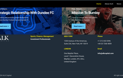
As a financial solutions firm that specializes in providing modern sports risk management, investments, acquisition, and effective operation services, ALK Capital – along with their sports investment arm, Velocity Sports Partners (VSP) – proudly became stewards and investors in the historic Burnley Football Club in 2020. After experiencing the devastation of relegation to play second-tier football in 2021, Burnley started their mission to fight their way back into the elite league. For ALK and VSP, this meant strengthening the team, invigorating the new management, and of course, updating their appearance.
ALK wanted their brand to have a professional, confident feel to represent their team's expertise in maximizing business potential. I chose to create a clean, text-based logo paired against a deep denim-blue to reflect the company and club's ideology of being traditional, yet elevated. VSP, on the other hand, was aiming for something fun and edgy. In keeping with the idea of forward motion and growth within businesses, the logo I made uses lighter, more playful blues and features a simple "V" with a sphere circling upwards.
In 2023, ALK and VSP celebrated Burnley's well-earned return to the Premier League!


New Jersey Coffee School
Whether you are looking to open up your own café, want to strengthen your barista skills, or simply love coffee and wish to learn more about it, the New Jersey Coffee School is the place to be! Located in Hoboken, NJ, this coffee school has a state-of-the-art coffee lab equipped with all the essential tools to make your favorite drinks under the guidance of their experienced instructors. The NJCS brought me onto their team to help with marketing and branding, and to design the presentation slides for the multiple classes that they offer. Working off of their existing logo, I provided them with cohesively styled curriculum materials, flyers, digital ads, and business cards pairing their signature teal color with a warm, coffee-brown color scheme. I organized the layout for the presentation slides and styled them in a way that would be easy for instructors to use while still keeping the students engaged. Throughout the slides are illustrations that I created to enhance the course material and make the information being presented more memorable through the use of iconography.
In addition to their classes, the NJCS also offers free coffee-tastings, special holiday events, and corporate/private events. Check out their calendar to see what's available!


Due North Designs
Specializing in furniture/home accents and wooden rings, this custom handmade woodworking shop was looking for a logo to represent their work. I designed a main logo along with two alternate ones to be used for social media and branding. The sketched woodgrain nautical compass surrounded by a saw blade and nails encapsulates the style and skillful creations of Due North Designs.

Pop-Corn Heist
The place for podcasts, trivia, news, and rankings on all pop-culture content "by fans, for fans." Pop-Corn Heist is a fun collaboration of two friends providing entertaining and thought-provoking content on the most popular shows and movies. I created their primary logo with a red, gold, and white color scheme to amplify the classic image of a bucket of popcorn. I designed alternate logos featuring caricatures of the hosts and well-known iconography from various films and series, as well as a template to be used for promotional postings.
Pop-Corn Heist added a secondary podcast to their network called A Simp's Guide to the Marvel Cinematic Universe and I was able to create their logo as well. I illustrated the hosts of this podcast to be swooning over their two favorite superheroes in a fun and romantic comic book style.


Grassy Sound
Whether you're looking for a laid-back trip on the coast or a hardcore fishing adventure offshore, this charter fishing business based in Hampstead, NC offers to show you a memorable time on the surrounding waters of New Topsail Inlet. Grassy Sound Charters was looking for a logo that would stand out amongst the very saturated local industry of charters and fleets. The name Grassy Sound comes from the Grassy Sound Channel in New Jersey where the Captain/Owner grew up. They wanted the logo to capture the history of the name and also reference their background in Marine Biology and career in the Coast Guard. I utilized the rope framing from the Coast Guard's badge and created a font to include a silhouette of a boat between the negative space of the "A" and "U" as well as a fishing pole in the "Y" connecting to the "G" hook. The background pattern in the logo is a topographic illustration of the Grassy Sound Channel.


Baby Shower Stationary
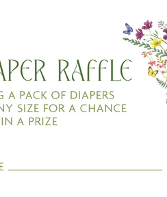
I had the pleasure of creating the invitation suite, food & beverage menus, welcome sign, and additional materials for the most beautiful baby shower. With the theme being "baby in bloom," I digitally painted individual flowers and greenery to be able to freely build multiple design elements. I created various bouquets, borders, and small accents to bring life to each printed piece. Among the floral prints were bright pastel signs for the gift and raffle tables.
Retern – Mock Website
In my Web Design class at Binghamton University we had to create a website and business cards for a made-up company based around a persona of our choice, The company I came up with was called "Retern."
Retern is a worldwide package return and exchange management company. Their goal is to provide an easy to use service for shipping all over the globe. The persona is an arctic tern, which has the longest migrations known in the animal kingdom. They have a continuous worldwide circumpolar breeding distribution and in their lifetime they will travel and average of 1.25 million miles. Retern aims to distribute packages with the grace and far-reaching distance of artic terns.
The color scheme is based on the artic tern's natural coloring; white and grey feathers, a black cap on their head, and bright red beaks and feet. The logo utilizes how the tern's appearance in flight mimics the shape of an "E" to form the name of the company "Retern."


